

Meet Binay
I use graphic design and photography to create beautiful communications for your target audience.
Photographer
Jul 2019 – Jan 2020 | Sacramento, CA
Working with kids, parents, and teachers reminds me that I'm part of something bigger than myself. It takes organization, self-confidence, and efficiency to thrive in this fast-paced environment.
Graphic Designer
Jun 2017 – Jul 2019 | Stockton, CA
Designing marketing campaigns comes from a strong foundational understanding of the brand voice. Know your company's mission, then let all you create pay tribute to that.
Sales Associate
May 2017 – Oct 2017 | Stockton, CA
Serving people via retail is about creating a welcoming space for them to explore who they want to be! Show them what they want, then arm them with the pieces to complete their vision.
Graphic Designer
May 2015 – May 2017 | Stockton, CA
Managing time with a diverse portfolio of clients means mastering clear and concise communication. Ask specific questions and actively listen to what they are saying to understand what they need.
Experience
I am formally trained to meet your graphic design needs with a B.F.A. in Graphic Design, B.A. in Psychology, and work experience since 2015. I supplement these skills by offering photography services to provide you with truly bespoke work.
My current role is Creative & Communications Manager at Central Garden & Pet.

Creative &
Communications Manager
Feb 2020 – Now | Walnut Creek, CA
Previously Digital Content Creator
Representing a vast portfolio of brands from the corporate perspective calls for an understanding of messaging hierarchy. I develop designs that establish Central's presence as the parent of this portfolio while honoring each brand's individuality.
Application
Scroll on to see how the lessons I learned from my experiences apply in real-life scenarios.
Digital Design


Promotional Emails
In-Shape Health Clubs
Objective
With sales happening every week, and inboxes being flooded with promotions, it's important to create unique pieces every time and avoid the spam folder.
Solution
While the seasons and holidays dictate the theme, I used different animation styles, graphics, photography, and headlines to keep things interesting.
Application
-
Promotional emails
UI: Animated Vector Graphics
In-Shape Health Clubs
Objective
In-Shape Health Clubs has a "Work Out and Win" rewards program encouraging Members to check in and earn prizes throughout the month. With the launch of the new app, it was the perfect opportunity to make the user experience more celebratory!
Solution
These badges would pop onto the screen when the user reaches their fifth check-in (free bottle of water) and twelfth check-in (free prize of the month).
Application
-
Animated vector graphics


Marketing Campaigns


Happy Healthy Days 2018
In-Shape Health Clubs
Objective
A member survey showed us that people come to the gym to "be healthy" more than anything else. So I asked, what does "healthy" mean? The answer spans mental, physical, emotional, and spiritual wellbeing! But as the question is posited to a fitness company during the holiday season of family dinners, encouraging proper nutrition should be the key focus.
Solution
A nutrition-based holiday campaign! The brand voice uses food puns and illustrations as a reminder to choose the right fuel for all the work you're putting into the gym.
Application
-
Digital Ads
-
Social Posts
-
Developed a library of illustrations unique to this campaign
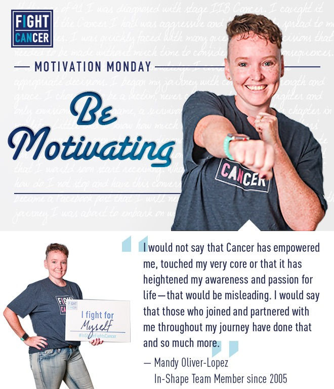
Fight Cancer 2018
In-Shape Health Clubs
Objective
Fight Cancer is an annual In-Shape campaign dedicated to raising funds for cancer research. Throughout October, In-Shape members are encouraged to participate in various activities, all of which contribute to St. Jude Children's Research Hospital and the American Cancer Society.
Solution
An In-Shape Club is a community experience! We recognized the high spirits that come from recognizing a familiar face in our marketing material, therefore made it a point to feature real members' stories and experiences with the fight against cancer.
Members also fight for their prizes! The Work Out and Win: Fit Club rewards program is famous for getting people excited about fitness! I gave those progress emails a revamp to be a more cohesive and visually appealing experience.
Application
-
Portrait & Product Photography
-
Fit Club Email Series Redesign
-
Motivational Email Series Development
-
In-Club Signage:
-
Banner
-
Schedule of Events Brochure
-
see more >


Women in Leadership (WiL) Summit
Central Garden & Pet
Objective
Central's Women in Leadership Council gathered for their first in-person summit in Atlanta, GA to network, celebrate achievements, strengthen bonds, and enhance Council initiatives.
Solution
I developed a WiL Council look that is based in Central corporate branding. I created PowerPoint decks for the two day summit, and captured lifestyle photography of the event for use in future corporate WiL communications.
Application
-
Summit PowerPoint
-
Event Photography
-
Invite Email
Event Branding


Panhellenic Formal Recruitment
University of the Pacific
Objective
With "A Wish Come True" as their sorority recruitment event theme, the Panhellenic Board at Pacific had two requests: use a dandelion and make it fun!
Solution
I drew the dandelion and experimented with a variety of color palettes to find one appealing to the diverse female population at Pacific. It was also important to not use colors favoring any one sororities’ branding over another, resulting in variations of each chapter’s colors combined.
The multi-page booklet was an opportunity to experiment with typography. I tackled the extensive copy by organizing the content into categories, and then applying consistent treatment to each category to distinguish it from the rest.
Application
-
Banner
-
24x36" & 11x17" Posters
-
Multi-page Booklet (black & white print request)
-
Shirt Design
-
Snapchat Filter
-
Facebook Event Header


Family Fitness Night
In-Shape Health Clubs
Objective
In-Shape's Family Fitness Night is a monthly event where parents get their kids excited about working out! Trouble was, the promotional material lacked the playful nature of the event. It was important to note the events of the quarter so parents have time to plan ahead!
Solution
I took the initiative to redesign the material and developed a distinctive look with an illustrated element of delight so parents knew exactly what to expect each month!
Application
-
Door Cling 19x28"
-
Invite Email
-
Media Monitor Slide (displayed on a tv monitor in-club amongst other event promotions)


Hot Dance Nights
In-Shape Health Clubs
Objective
In-Shape's Hot Dance Nights is a summer-long dance party! This Group Fitness event called for an identity of its own in an ode to summer fun. While Hot Dance Nights is popular, it didn't have any distinction from other Club events. I was given the direction to "make it like a movie poster" and ran with it.
Solution
Movie posters are intriguing, informative, and succinct. I approached it with a music festival twist, creating a graphic emblem that made an impact on print, and danced to life on digital media.
Application
-
Logo
-
19x28" Poster
-
Social Tile
-
Landing Page Header
-
Email Header


Tracy Community Event
In-Shape Health Clubs
Objective
It's a Club-hopping event! (In-Shape Health Clubs that is.) The Tracy locations hosted member appreciation events with workouts and refreshments. This grand event needed to communicate a lot of information without looking "too busy" in-club.
Solution
I created this 24x36" poster featuring the beautiful Altamont Pass that is widely recognized as a part of the Tracy community—look for the three windmills representing the three participating clubs—and pulled elements to animate for some easy breezy digital collateral.
Application
-
24x36" Poster
-
Social Tile
-
Email


Brand Identity


Job Fair Brochure
Central Garden & Pet
Objective
Central needed a revamped brochure since the launch of the new corporate branding identity. This resource was intended for marketing use at job fairs across the nation to familiarize prospective employees with the Central name and associate corporate with the better-known family of brands.
Solution
I relied on the Central brand guidelines to dictate the design standard, supplementing the copy with in-house and stock photography, and a QR code for easy access to the job application portal.
Application
-
Corporate branded brochure
Central Compass
Central Garden & Pet
Objective
The Learning & Development Human Resources Team at Central needed to simplify communications about the Annual Performance Management Process. Employees lacked one resource that explained: the three different processes occurring throughout the year, important deadlines, and relevant vocabulary. This resource needed to follow the corporate brand design guidelines while being different enough to leave a lasting impact.
Solution
I collaborated with Central's Head of Communications and the Senior Manager of the Learning & Development Team to strategize and execute a program detailing everything an employee needs to know to grow their career at Central.
It was a rigorous process involving:
-
Sifting through numerous documents and decks to compile the content
-
Re-writing content for clarity
-
Introducing a Gantt Chart to solve the problem of no existing document that showed an overview of the year with all three processes accounted for
-
Developing the name, theme, look and feel of the program
Application
-
Compass program logo
-
Digital Toolkit PDF
-
Printed 11x8.5" Desk Drop Item
-
Intranet Page
-
Email
-
(+ Learning & Development site, educational videos, and webinars executed by the HR team in partnership with myself)


The Placement Exchange: Recruiting Event
University of the Pacific
Objective
The Placement Exchange (TPE) is a professional hiring resource for Student Affairs jobs at campuses across the nation. Pacific needed a package for potential clients to get them excited about career opportunities at University of the Pacific.
Solution
I relied on the University brand guidelines to dictate the design standard, and added the org charts and vector graphics to supplement the heavy copy.
Print media requires consideration for the more technical aspects of design, so this was also a chance to put my ruler and X-Acto knife to use!
Application
-
Stacked informational pages and organization chart
-
Appointment Note
-
Thank you card
Parent Training Program
University of the Pacific
Objective
Parent Training is a service for families of children ages 3-10. Parents bring their children to campus where undergraduates look after them in a classroom setting while the parents learn behavior management techniques from the graduate students.
Over the years, the program has decreased in popularity. While we have measured its effectiveness, the results could only endure if the children are exposed to the same type of behavior monitoring in every aspect of their lives. My goal was to bring it to the classroom.
Solution
I did research by sitting in on a kindergarten class, and asking the teacher what tools could be helpful to her. We came up with a list of supplies, and I noted that my target audience (recent college graduates aged 22–26 in the Stockton area) enjoys a sense of dry humor and useful swag. The program I created details basic behavioral psychology principles and how they can use them. I also made a puzzle game for the kids!
Application
-
Zines (which double as posters)
-
Car Shade
-
Mug
-
Puzzle


Watermark Labels
University of the Pacific
Objective
Watermark Labels is a Lodi, CA based winery and printing company. They needed wine labels that reflect their community and show off their printing capabilities.
Solution
I presented two options:
-
Cream, with a purple foil accent to accentuate their sophisticated printing machinery
-
Rust, with deep purple and green accents to represent the flavors of the wine itself: “spicy, jam, fruit, and peppery”
Staging the advertisements was all about using colors and textures that complement the labels.
Application
-
Wine Labels
-
Magazine Advertisements
-
Product photography

Juanita H.
Working with Binay has been an absolute blessing. She has an amazing work ethic and takes pride in every photo she takes. She is wonderful with children and versatile in every aspect resulting in extraordinary work. With her phenomenal skill set and her willingness to try new things, Binay has easily become one of my favorite people to work with!
Samantha L.
I have had the pleasure of working with Binay for a little under 2 years now. What makes that so extraordinary is the amount of growth, design knowledge, and comfort zones she has broken through in just that short span of time. She continually finds the meaning in every asset she creates, executing each project with attention to detail, consideration of medium and media, and with time to spare. She has the capability (and has continued to work and master this craft) to discern elaborate projects, connect and conceptualize brand initiatives with campaigns and create simplified, beautiful templates out of the most confusing and stress-inducing projects. This not only is a skill many wish to capture in their design tenure, but something everyone on the team appreciates and admires from Binay. She is approachable, communicative, inspired, and always ready to collaborate and excite anyone over a new idea, new concept, new anything. If you're reading this and wondering if you want to hire her, work with her, connect with her, let me help with that decision: Do it. You don't find people this passionate, this motivated to stay up until 3am on her weekend learning about photography and cultivating an entire side-hustle over a split-second decision she made to learn the craft. You don't find people that just craft an entire campaign in an afternoon over a conversation you once had during a coffee break. So hire her, connect with her, work with her. It's beyond worth it.

Megan D.
Working with Binay was so fun and easy! My husband and I are not picture people but it was important to us to have maternity photos to look back on the milestone. Binay coached us through different poses and kept us laughing the entire time. She did a great job capturing our life and what is important to us—including the home we spent so much time working on and engaging our pesky cat. The photos are beautiful and timeless—I have no doubt we will look back on them for many years to come!

Photography
Photo sessions with me are all about celebrating you and yours. Maternity, Newborn, Engagement, Family, Graduation, Lifestyle, are just some of the moments I've captured! I'm always excited to try the latest Pinterest trends, so show me what you need and let's make it happen. Click here or on any image to see galleries!


